Replies: 1 comment
-
|
We're now fairly locked in on this, and I reckon it's really ticked all those boxes from the initial requirement listed above. Feel free to share your input here. |
Beta Was this translation helpful? Give feedback.
0 replies
Sign up for free
to join this conversation on GitHub.
Already have an account?
Sign in to comment
Uh oh!
There was an error while loading. Please reload this page.
-
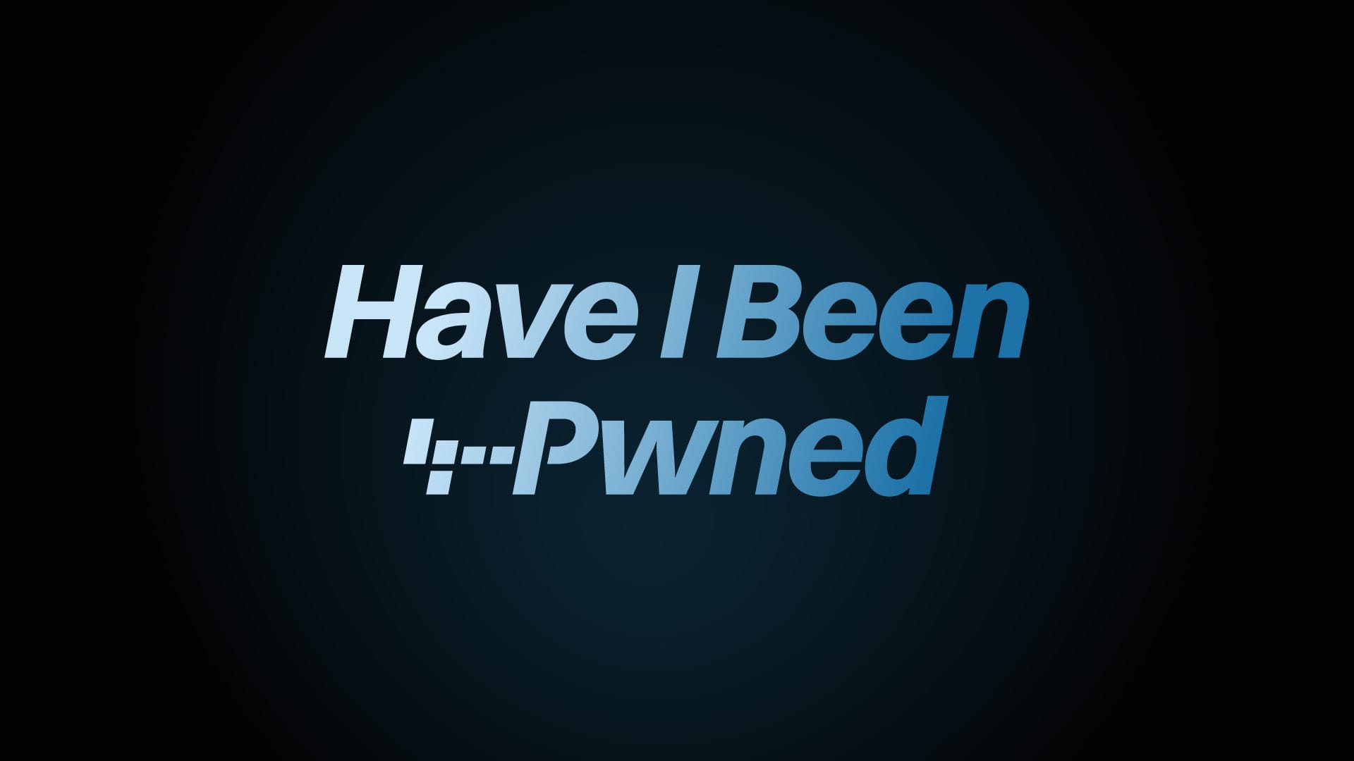
I built the original logo as a tongue-in-cheek nod to a SQL injection pattern, the source of so many of the breaches in HIBP. It's literally just the following text: ';--have i been pwned?
I just copied and pasted that from the front page - no image! I like the abbreviated version of just the "';--" characters and like many brands, it's a good way of having a small, recognisable representation of HIBP. But it's flat. And basic.
What I'd really like to do is give it a refresh so it looks modern and more stylised. I want to avoid the cliched padlocks and binary and I also want to drop the question mark (I haven't used this in any textual reference to the project name for a long time now). I do like the use of blues and gradients and suggest that theme should be retained throughout.
As things have grown, this logo needs to also adorn everything from API documentation to contracts to swag.
Ideas and suggestions welcome, what can we do with this thing?
Beta Was this translation helpful? Give feedback.
All reactions