Accessibility (Readability) #202
Description
At age 81, my eyes are getting worse, but they are nowhere near as bad as some people I know.
The trend in UIs is fainter fonts and lines. Many Web pages these days are unreadable to me.
I can't read the current Playspace UI.
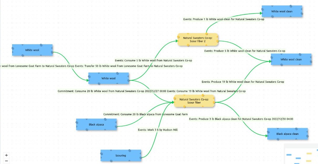
I can see the nodes and the general shape of the flow, but can't read any of the labels on nodes or lines.
Can we do better? Is it the font or boldness or size, or all three?
I recognize that balancing all of those factors is a hard problem, so I don't expect magic