Several journals have specific requirements for figures, and following these tips helps create high-quality figures that conform to these requirements. Having clean figures has an impact on readability. It will also speed up the publication process (as you'll need less back-and-forth with the editor to update your figures after acceptance).
Note
You may consider reading the Nature figures guide, even if you don't plan to submit to a Nature journal.
When possible, your figures should be:
- Vectorized: images are created directly from geometric shapes such as points, lines, curves, and polygons. One can infinitely zoom in, and it remains smooth. Typical formats include PDF, SVG, or AI (Adobe Illustrator).
- Editable: you can directly edit the text of the figures, e.g., using a tool such as Adobe Illustrator. Note that a text can be vectorized but not editable, if the text is defined as a contour shape (default in matplotlib).
Sometimes, using a vector format can lead to a very heavy plot (e.g., a scatter plot with millions of points). In that case, your Figure should be:
- Rasterized: a "usual" image as a grid of pixels. The resolution (i.e., the DPI) should be sufficient. For some journals, 300 DPI is mandatory.
- Vectorized legend: although the main plot is rasterized, you can keep legends/labels vectorized and editable. It's possible to save a PDF with a mixed format (raster and vector). [See code snippets below]
- Use standard color palettes. See this great seaborn color documentation.
- When the same categorical legend is repeated multiple times in your plots (typically, a list of model names, or cell types), ensure you use the same colors for the same categories. You can define a dictionary of (
category,colors) pairs. - Ensure the text is big enough compared to the rest of the plot. To do that, simply make the Figure small: it will make the text bigger compared to the rest, and you can then enlarge the plot (since it's vectorized, it will conserve the quality). [See code snippets below]
- Avoid useless information, keep your plot straight to the point. Typically, you can avoid the borders surrounding your legend, or you can use light borders instead of the heavy default "square border". [See code snippets below]
- One plot is usually only one subfigure (e.g., Figure 3f). You'll then need to assemble these PDF subplots into one Figure (to be saved in PDF format again to keep the vector format). For instance, you can use PowerPoint. In that case, set in
Design > Slide Sizea width of 21cm (the height will depend in your plot). - Try to keep the same font (for the matplotlib plots and also the PowerPoint assembly). Defining this in advance will help a lot. For instance,
Arialis a good default choice. - Ensure everything is well aligned.
- [Important] Make sure all your figures are easy to reproduce. When your paper is accepted, you may need to make minor styling modifications to plots that you made 1+ year(s) ago! The best way to do that is to save the data underlying the Figure. E.g., (i) if you made a heatmap, save the table as a
csv, or (ii) if you made a scatterplot, save the dots' location and their labels. TL;DR: When editing a figure, you want to (i) re-generate it in three lines of code, (ii) without any data except the light data underlying the Figure, and (iii) retrieve them easily. You can make a GitHub repository specifically dedicated to Figure reproducibility.
At the beginning of your script, set the matplotlib settings to the three lines below.
import matplotlib.pyplot as plt

plt.rcParams["pdf.fonttype"] = 42  # TrueType; preserves editable text
plt.rcParams["ps.fonttype"] = 42
plt.rcParams["font.family"] = "Arial"  # optional but recommended
Then, you can produce your plots and save them in a vector format (PDF recommended).
### make your plot ###

plt.savefig("xxx.pdf", bbox_inches="tight")If you make a raster plot (e.g., a scatter plot with millions of dots), you can use the snippet below to save the legend/labels in vector format but keep the main plot in raster format.
Note
Combine this with the rcParams configuration from the previous section to also enable the editable mode.
### make your plot ###

fig = plt.gcf()
axes = fig.get_axes()

for ax in axes:
    for coll in ax.collections:
        coll.set_rasterized(True) # rasterize scatter collections

# save in vector format (with enough dpi for the raster part)
fig.savefig("xxx.pdf", dpi=300, , bbox_inches="tight")By default, your legends have borders and are shown in the top right corner of your Figure. We recommend having the legend outside of the plot (e.g., on the right) without any border. We also recommend removing the spines using seaborn to remove useless borders.
sns.despine(offset=10, trim=True)
plt.legend(bbox_to_anchor=(1.04, 0.5), loc="center left", borderaxespad=0, frameon=False)Try different figure sizes and ratios. Make the plot compact and ensure the text sizes are big enough compared to the Figure.
fig, ax = plt.subplots(figsize=(4, 3))

### make your plot ###In this example, we show how to improve a dummy plot via (i) changing the size of the plot, (ii) moving the legend location, and (iii) removing the borders/spines. The plot becomes more readable. [See Python code below]
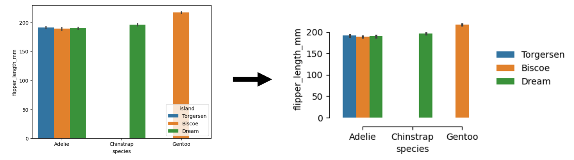
import seaborn as sns

df = sns.load_dataset("penguins")

sns.barplot(data=df, x="species", y="flipper_length_mm", hue="island", palette="tab10")import seaborn as sns
import matplotlib.pyplot as plt
plt.figure(figsize=(3, 2)) # smaller size, and then zoom-in
df = sns.load_dataset("penguins")
sns.barplot(data=df, x="species", y="flipper_length_mm", hue="island", palette="tab10")
sns.despine(offset=10, trim=True) # remove the spines
plt.legend(
bbox_to_anchor=(1.04, 0.5), loc="center left", borderaxespad=0, frameon=False
) # legend on the right with no borders